Posts Tagged ‘logo inspiration’

  • Mon, Nov 8 2010

    As we’re working through the design of the Leveler, here are some images that are inspiring us. Hopefully they’ll inspire you while you come up with some great logo designs.

    The Home Hero:

    The Home Hero takes a very ordinary, utilitarian-designed fire extinguisher, and turns it into a beauty. It’s still just as (if not more) functional than a standard fire extinguisher, but by starting with the base of the normal fire extinguisher form and using subtle curved surfaces and outlines, it becomes an object of beauty. The Home Hero is also a great example of using color pops (red) in two key areas, while balancing the glossy white with matte grey.

    OO Projector:

    This one ends up on a lot of our image boards. From the top it’s a very iconic circle, from the front it’s got that iconic eye popping out at you. When you merge two profiles, often some weirdness ensues, but not with this projector. The curve created by the intersection of the two profiles keeps your eye moving around the whole object, and the surfaces that connect them shift smoothly.

    Harmon Kardon Receiver:

    We’re drawing a lot of inspiration from this one. It’s got clean lines all around, and uses really basic forms. What makes it great is the proportions and material uses. We’re especially loving how the knob is a tight circle with very crisp edges.
    Get to it!

  • Thu, Oct 14 2010

    The imagery we have chosen to offer as inspiration for the Contort has been aligned with the direction that the product has taken in the ID phase. As always happens in the Quirky design process, the aesthetics and functionality of this product are continuing to evolve.

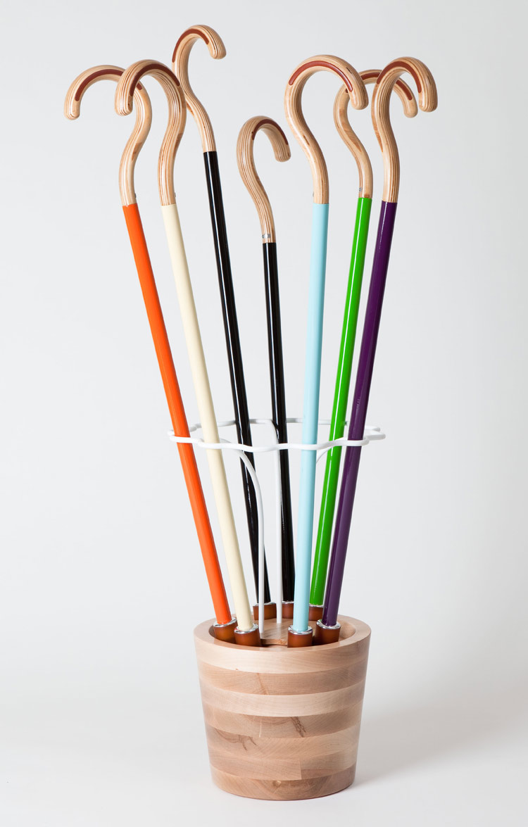
    1. We love the simple geometry of these canes. All of the details are very well proportioned, and the color palette is beautiful. Plus, this product has a nifty storage base that wrangles all seven of your canes (who doesn’t have seven canes?) like Contort Port wrangles your wires.

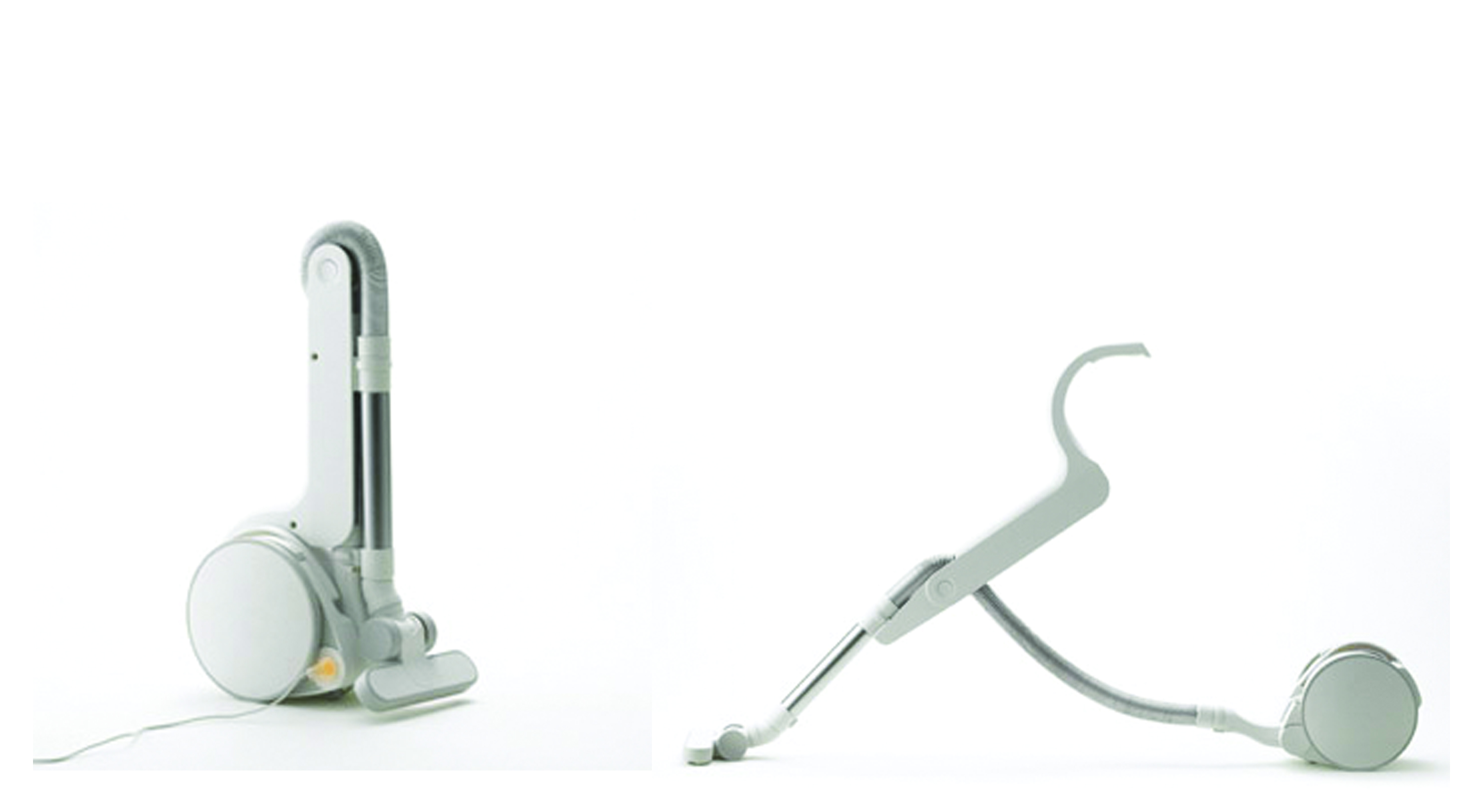
    2. This Metaphys vacuum cleaner collapses for storage in a very elegant way. We aren’t used to seeing such complicated objects transform in such a simple, natural way.

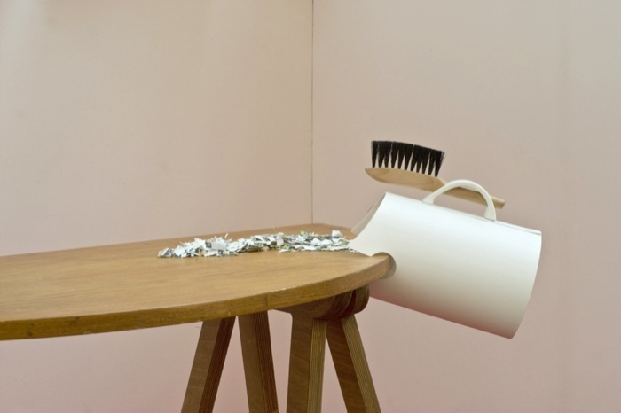
    3. This waste bin has really interesting added functionality, without complicating the concept. By simply hanging off the edge of the table, it creates a much more meaningful experience.

    4. This accordion table can fit into its surroundings by changing shape. We really love the fact that changing its shape reveals those nice accent colors, adding visual interest.

    We can’t wait to see what you come up with! Participate in the logo design project here.

  • Fri, Oct 1 2010

    Here are some of the products that are inspiring us while we’re designing Cable Collar. Hopefully they can inspire you over the weekend while you design your logos for the next phase of development.

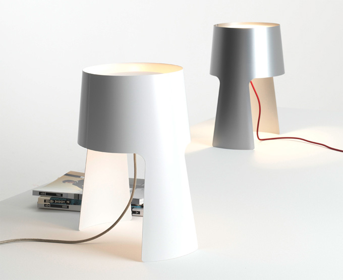
    1 – Lamp with red wire: This product is all about celebrating the way the body and the wire play together. It creates a delicate balance between the actual product and the necessary wiring involved.

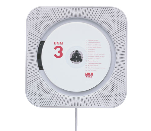
    2 – Muji CD Player: Muji’s famous CD player beautifully takes some very basic geometry and uses it to focus your attention on what you put into the product (the CD). At the center of Cable Collar will be your plugs and their outgoing cords. Our design’s form will hide the wrapped wire but showcase those plugs in its center.

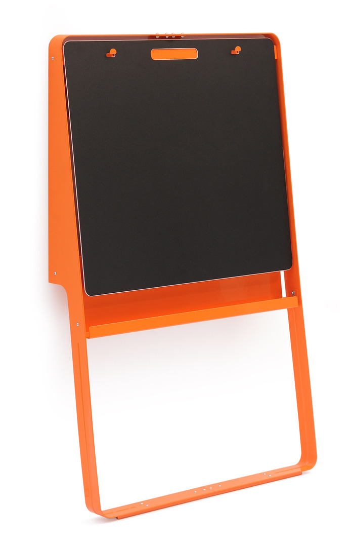
    3 – Leaning Easel: This easel uses pretty simple geometry and the power of what’s already there (gravity) to hold it in place. We’re designing Cable Collar to be easily installed, either hanging by gravity or friction (stay tuned to find out). Also, we’re loving the color choice.