Announcing: Quirky. Version. 3.
by jessAnd now…
The moment you’ve all been waiting for…
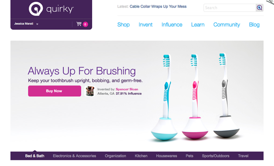
It took tons of hard work, many late nights, and innumerable Diet Cokes and Doritos bags, but we did it.
Some highlights:
- More intuitive structure and design.
- Shopping cart functionality, with clear breakdowns of which products are in development, which are in production, and which are shipping now.
- New community dashboard, which makes it easier to connect with our more than 35,000 community members.
- New infographics explaining the Quirky process and ways to earn influence.
- New evaluation format that allows users to browse, vote, rate, and comment on ideas quicker and easier.
- More ways for users to track their activity on the site.
- More ways to access and edit account information.
- Change to pre-order commitments: we’ll require a credit card for all commitments, and we’ll no longer default deduct those amounts from your accounts.
- Improvements to user Inbox interface.
We’re super thankful for your patience, and we’re excited to hear what you think!
31 Comments
By Alan
Site does look great, but something can’t be right with my account. I had something like $120 pending from the Slingback, but now I only have $4 pending? Is this a glitch, or am I on the super raw end of a influence restructuring?
By Aaron
My pending amounts have dropped drastically on all products too. What is this? Most are about half what I had and some are a third or less than what I had.
By jess
@Alan and Aaron: Looking into it guys…
By Tyrel Hatfield
The site looks great Quirky Team! Appreciate all your hard work. Keep it up.
By Ken Somerby
Can’t submit to kitchen brief error message says I use to many characters but I no where came near 140
By Samuel
SIte looks nice, but my pending balance has also dropped by quite a bit
By jaraldo
Site looks great! .. I also have a severely reduced pending balance
By yojanjan
The text font sizes, thread boxes, and pictures are all way too big, we now have more pages to navigate and longer page to scroll to get to the information. Incidentally the text in this comment box (as you are typing) is minuscule!
Clean and simple is only good when you are able to organize the same amount of information thus, not when you have severely reduced the information presented so that it appears clean and simple.
Please keep the Product # for “Help Choose Our Next Product” and “Help Choose A Closet Organization Product”, that’s how we keep track of what we have done for which.
By aje007
My pending balance dropped as well. It’s about a fifth of what it was before.
By Peter G.
Very, very nice!
Hope the tech team gets to sleep in on Friday!
By Ann Marie
I am having a brutally hard time seeing this. The font is so light and tiny, the white seems to pulsate and the gridlines make it awful in a different way. I am in physical pain trying to read the pages. Nothing is worth this.
Don’t want to scroll through each idea at a time. The list was far better, for choosing to preview, then comment and go back and vote later. This is too burdensome.
Please email me when something changes. This will not work for me, at all, ever.
For the love of God, hire these guys: http://soekan.com/
These all white pages, bad text, visually painful, horribly sized font falls short of mediocre. Who the hell calls themselves an expert or even a professional in this field and churns out this crap?
By Ann Marie
I had a link on my reference sheet for my props, but now, the entire profile, photo, page, degree of involvement, personal information, etc… is all available on that page. It’s far more public than I ever would have wanted a prospective employer to see, immediately.
This version is really invasive in this respect. I removed it from my references immediately. What were you thinking?
By Peter G.
I just noticed that one could no longer embed HTML tags in Evaluation comments… which may for the best, however… many users had provided supplemental images that no longer appear. Ideally a section or subsection of the visuals area (to the right) to where we could upload pics would be fantastic. (…and bye-bye line-breaks?!?)
By Username (required)
My balance is not correct ,
By Quirkster
Maybe it is my screen, bust I can hardly read the pale, small lettering.
I love the look of it.
When I come to the end of the page, I have to scroll to the top to go to the next page.
It must have been so much work! We will be patient while you work it out…
By Stalias
What they said.
I was really hoping for tools to help me sort and compare entries before voting. The new pages make evaluating even more time-consuming (and they’re so hard to see — MichelleB, is this discrimination against the elderly?! — that it’s likely to decrease user productivity. And sanity.
By Ken Somerby
The site does look more professional and yet less Quirky:{ I think the change was to drastic and to much to soon….It is very hard to navigate through and full of errors. You probably alienated more people than impressed, people will adapt, however version #2 was by far more user friendly…You would have been better off just adding the shopping cart feature and left the site design alone and slowly integrate requested tools. I must agree with Ann Marie and that it would have been worth outsourcing the project to an established web design development company as there are some fantastic ones out there at fair prices….
By Austin Quirky
Wow, Shiny new. I wasn’t expecting such a big change… especially in my account balance. I went from $974 to $163. That sucks. Apparently I no longer get credit for the 204 Stem Gardens that were sold. I’m sure this is just a glitch, but I was expecting more from the new roll-out. Looks like it is going to take a lot of work to get Quirky v3.0 up to what Quirky HQ intended.
Profile page:
I also agree with Ann that I don’t like the props posted so visibly on my profile page… and the fact that now you have to dig to see the products I have influence in. I too changed my name to an alias now. I don’t like gender being at the top of the page, or first product. I emptied the 1st product field, but it didn’t got away. Also the final question under edit profile asks if you should hide or show how much you have made, but dosn’t indicate what checking the box means (only one box, is it hide or show?)
I also noticed the link on my bookmark bar doesn’t load the site anymore (had to type manually quirky.com) which kind of sucks since that is my social sales link… does that mean no one can access the site from all my previous efforts spreading that link around?
overall: Site looks better to buyers, but not for daily users. hard to read with so much white, it hurts my eyes. I hope the quirks get ironed out soon.
By Justin Riehl
Where is my profile and inbox?
By jess
@Peter: Funny. The work has only just begun!
@Ann Marie: Always a pleasure to hear from you.
@Quirkster and Stalias: An easy fix is zooming in on the page. I’m not sure it’s an age thing — I have to do this with certain websites too!
@Ken: Everything new takes some getting used to.
@Justin: Click on your name on the top left corner — you’ll be able to access your profile and inbox in the dropdown menu.
@All: Thanks so much for your kind words. It took a lot of work, but we’re proud of the results! We’re still looking into the pending balances ish, and we’ll be working throughout the day and weekend to fix the bugs we weren’t able to catch in staging.
By jmor
One of my biggest problems is that my pending balance went from about $20 to ZERO?!
By EMDESIGNS
Brilliant site that the team made i am loving it is amzing and it has a lot of quirky in it lots of personality and good taste
but still with some errors so we will be waiting for this to improve and for this site to became the ultimate site ever.
By EMDESIGNS
Maybe this error is common to other for me the pending blance is wrong to so this bug in the code must be happening to all the people. So let’s wait for the pro’s at quirky to solve it .
By EMDESIGNS
Hello my friends at quirky i am so please with this site that i will give my extremely regards to the crew of designers that worked in the UI platform is very Simple , i think it follow the principles of Dietter Rams
By Cody
I like it.. but then I do not.. The shopping aspect is better, wish you could choose between using your available balance or a credit card instead of Quirky picking which one you use. The entire influence page seems scattered and extremely hard to understand how to do anything.
I’m not sure yet if its just completely new and will take time getting used to or if I’m just not a fan.
By Carly
Well, I dont have trouble reading the grey text, but I am young. I can see how it would be hard to read though.
I do agree with the above comment that the influence page is really scattered, i also dont like how you can’t see how many votes you have left on the main influence page.
I also really miss the feature of the check box when you vote for something, not only is it confusing, since there is already a check in the box, but i miss being able to see at a glance the checked boxes that i vote for.
Its different, but like all things I’ll get used to it after a while
By Clinton
Looking forward to watching the iteration process!
The function is pleasantly close to what I need, and the look is pleasantly more than I expected.
Now, to just get used to it.
By Ali
I too wonder why the pending balances are so much less than they were pre-redesign. Could the Quirky staff please explain this change?
Thanks a bundle.
By Peter G.
Back with one more comment…
Kudos on how the products are front and center in the home page… a very e-commerce retail feel… well done.
(Hope featured/showcased products in upper half get rotated with each user visit)
By jess
@Ali: Check out this blog entry, posted today. Explains it all! /2010/10/your-potential-cash-money-is-still-there/
By Kaari
Considering that half of the internet users use IE could you please make it functional in IE too? As it is now, I can’t delete or edit comments or even create a new forum posts. The text is so small and lacking of contrast it is nearly impossible to see.
Considering that Quirky community is a tech savvy knowledgeable crowd, I think it would have been a great idea to utilize the Quirkies to do a beta test of the new website before you launched it. Many of the bugs now seen would have been caught by a small crowd of testers.